Are you struggling to make your Excel charts more insightful and visually appealing? Adding a line to a bar chart can be a game-changer, helping you highlight trends, compare data, and tell a clearer story.
But how do you do it without getting lost in complicated steps? In this guide, you’ll learn exactly how to add a line to your bar chart in Excel—quickly and easily. By the end, your charts will not only look professional but also deliver powerful insights at a glance.
Keep reading to transform your data presentations with just a few simple clicks!
Credit: excelinsider.com
Prepare Your Data
Adding a line to a bar chart in Excel needs clean data. You must organize and set up data properly first.
Good data preparation helps create clear charts. It shows trends and comparisons easily.
Organize Data For Bar And Line
Place your data in columns or rows. Use one column for categories, one for bars, and one for the line.
Make sure each row or column matches the same category. This keeps the bar and line data aligned.
- Column A: List categories or labels
- Column B: Data for bar chart
- Column C: Data for line chart
Set Up Data In Excel Sheet
Enter your data clearly in the Excel sheet. Use headers to name each column for easy understanding.
Keep numbers consistent and avoid empty cells. This helps Excel create the chart without errors.
| Category | Sales (Bar) | Growth Rate (Line) |
|---|---|---|
| January | 500 | 5% |
| February | 600 | 7% |
| March | 550 | 6% |
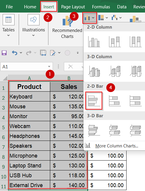
Create A Basic Bar Chart
Creating a bar chart in Excel is a simple way to visualize data. Follow these steps to make your data easy to understand.
Excel offers tools to transform numbers into visual insights. Learn how to add a line to your bar chart for more detailed analysis.
Select Data Range
Begin by choosing the data you want to display in your chart. This selection forms the foundation of your bar chart.
- Open your Excel spreadsheet.
- Highlight the data range you wish to include.
- Ensure your data is organized in columns or rows.
Insert Bar Chart
After selecting the data, you can easily insert a bar chart. This will help you visualize your information effectively.
- Go to the ‘Insert’ tab on the ribbon.
- Select ‘Bar Chart’ from the Charts group.
- Choose the type of bar chart that suits your data.
Now your basic bar chart is ready. You can further customize it by adding a line to highlight trends or comparisons.
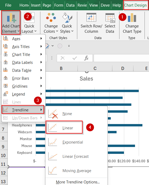
Add Line To Bar Chart
Adding a line to a bar chart in Excel helps show extra data clearly. It combines two chart types into one. This makes your data easier to understand.
You can add a line to compare trends with the bar values. Excel lets you do this by adding a new data series and changing its chart type.
Insert Line Data Series
First, add the data you want to show as a line. Put this data next to your bar chart data in the worksheet. This helps Excel recognize it as a new series.
Next, select your existing bar chart. Right-click the chart and choose to add a new data series. Select the cells with the line data. Excel will add this as bars at first.
- Place line data next to bar data
- Click the bar chart in Excel
- Right-click and choose “Select Data”
- Click “Add” to insert new series
- Select your line data cells
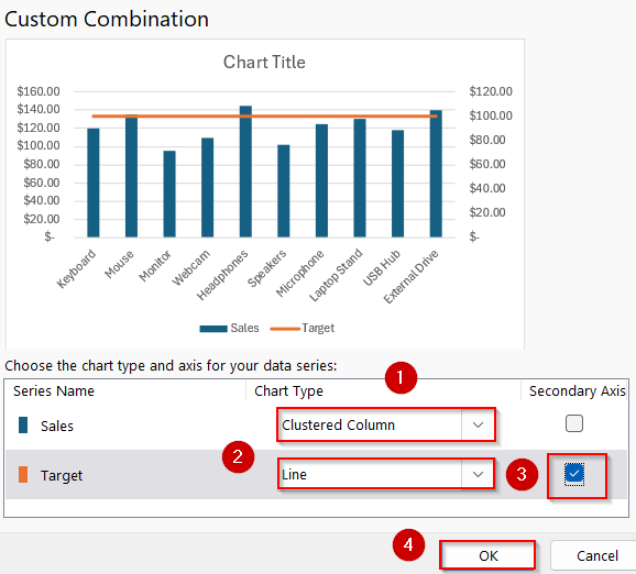
Change Chart Type For Line Series
After adding the new data, change its chart type to a line. Select the chart, then go to the chart tools menu. Find the option to change the chart type for each data series.
Choose “Line” for the new series. This makes the data show as a line over the bars. You can adjust the line style and color to make it clear.
- Select the chart
- Open “Change Chart Type” from the chart menu
- Find your new data series in the list
- Change its type to “Line”
- Click OK to apply the change
Credit: excelinsider.com
Customize Chart Appearance
After adding a line to your bar chart in Excel, you can change how the chart looks. Customizing the appearance makes the chart easier to read and understand.
You can change colors, styles, labels, and titles to match your needs. These changes help highlight important data.
Adjust Colors And Styles
Changing colors helps separate the bar and line parts of your chart. Use different colors to make each data set clear.
You can also change line styles, like dashed or solid, to show differences. Bar styles, like fill and border, can be adjusted too.
- Click the chart to select it.
- Choose the bar or line you want to change.
- Use the Format tab to pick new colors.
- Change line style to solid, dashed, or dotted.
- Adjust bar fill and border colors.
Add Labels And Titles
Labels and titles explain what the chart shows. Add clear titles so viewers understand the data quickly.
Data labels show exact numbers on bars or lines. Axis titles describe the values on the sides of the chart.
- Click the chart and go to Chart Elements (+ icon).
- Check the boxes for Chart Title and Data Labels.
- Click on the title to edit the text.
- Add axis titles for X and Y axes.
- Position labels so they do not block the chart.
Credit: excelinsider.com
Frequently Asked Questions
How Do I Add A Line To A Bar Chart In Excel?
To add a line, select your bar chart, go to the Chart Design tab, and choose “Change Chart Type. ” Select “Combo,” assign one series as a line, and keep the others as bars. Click OK to apply the line to the bar chart.
Can I Customize The Line Style In A Bar Chart?
Yes, you can customize the line style by clicking the line in your chart. Use the Format tab to change color, width, and dash type. This enhances your chart’s clarity and visual appeal.
What Is The Purpose Of Combining Line And Bar Charts?
Combining line and bar charts helps compare different data sets in one view. Bars show quantities, while the line highlights trends or averages. This combination improves data interpretation and presentation.
How To Add A Secondary Axis For The Line In Excel?
In the Combo chart settings, check “Secondary Axis” for the line series. This allows the line to have a different scale from the bars, improving data comparison and chart readability.
Conclusion
Adding a line to a bar chart in Excel helps show data clearly. You can highlight trends and compare values easily. The steps are simple and quick to follow. Practice a few times to get comfortable with the process. This skill improves your reports and presentations.
Keep exploring Excel’s features to create better charts. Small changes make a big difference in your work. Try adding lines to different charts for practice. Excel becomes easier and more useful with each try.